Just because something is a trend doesn’t mean everyone should do it. But part of being a good designer – or a good client, for that matter – is knowing the latest and greatest ways of doing things. The purpose of this blog, then, is to discuss six of the latest trends in web design to make sure your work in 2015 doesn’t look like something you did in 2012 (heaven forbid!).
1. Be responsive.
This doesn’t mean be responsive to all customer or client needs (although that’s a quality that never goes out of style); this is about utilizing responsive design in all of your web work so all those mobile users see your site in its best light. Whether your site is WordPress or something completely hand-made, ignoring this audience is a big mistake.
2. Use big pictures.
Oversized, beautiful images are showing up as backgrounds and key images in more and more sites. Using videos as backgrounds is also becoming more common. It’s a simple, graphic way to make your site stand out. And, of course, as the images take up more space, sites become less copy heavy – which means what copy there is needs to work harder. This one uses video and sound: myprovence.fr/snapshots2012/en
3. Use big words.
Big, beautiful fonts and typefaces can be as striking as a big, beautiful image. Now that so many fonts are available for less money – or, better yet, free – designers have more tools to create brand-building typography. Check out this example: hioscar.com
4. Less clicking, more scrolling.
Now that people are used to it, scrolling is easier than clicking, more intuitive, easier to create, reduces load times and allows for more dynamic interaction between websites and their visitors. Also, by scrolling, it keeps users exactly where you want to keep them. As you design, though, be cautious of the toilet paper scroll – an infinitely long website that may cramp up the scrolling finger of even the most robust user. Here’s an example of a scrolling documentary: arte.tv/atterwasch/#zukunft
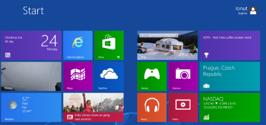
5. Flat is still around.
Although in 2015, web design should really be opening up to include more styles than ever, the flat design trend is still here, and going strong. In fact, this UI trend may just about the one thing Microsoft (Windows 8 and Mobile) and Apple (iOS and OSX) agree on.
6. Tiles keep you flexible.
Card, tile and modular designs are not new, but they are great tools for designers who want to keep their designs flexible – especially when responsive design is a priority. It’s a great way to rearrange columns without getting sloppy or disorganized. It’s also a simple, fun way to browse a lot of data. Here’s one example: traveloregon.com
Of course, there are more than six trends. As we approach a new project here at Envision Works, we explore and incorporate hundreds of design angles, techniques and trends – whatever works best for that client or project. But no matter where we end up, it helps to make sure our design vocabulary is up to date and as large as possible.
Did I miss anything? Is there a trend you think should be added to my list (or bump off one of my six)? Feel free to comment.
And Happy Web Design New Year!